ClientWorks
Navigation Framework
ClientWorks is a suite of applications that financial advisors and their staff use to manage their book of business, make trades, research opportunities, and perform many other tasks. The ClientWorks navigation framework integrates these applications into one cohesive product accessible by a single login.
When we first started creating ClientWorks, we designed a navigation framework that prioritized frequent and easy switching between apps. While that framework had a new UI and design, the underlying technology that managed the applications was based on a legacy system. Some technical issues led to a decision to redo the underlying architecture, which gave us an opportunity to redesign the nav.
With the new redesign, we were able to leverage knowledge we learned after months of user testing. This gave us a much better understanding of how the applications that made up ClientWorks would be used together. The new nav framework de-emphasized the app switcher and prioritized in-app actions. It allows third party apps to feel more integrated, and relies on built-in browser technologies like favoriting, tabbing, and history, instead of equivalent technologies that we had integrated into the previous nav.
For this project, I served as an interaction designer and as the visual designer.
An opportunity
When we began planning ClientWorks, we designed a navigational framework based on our best expectations for how our users would move between the ClientWorks apps. Due to some technical issues on mobile, development needed to recode the nav framework. This gave us an opportunity to improve the nav by leveraging the knowledge we had gained from user testing over the previous few months.
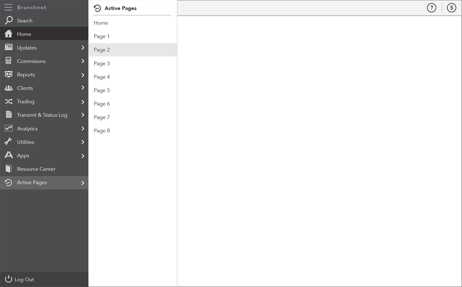
The previous nav ran down the left side of the app. We assumed that users would be frequently moving between apps and the always visible nav facilitated that. Multitasking was handled by the "active pages" window manager.
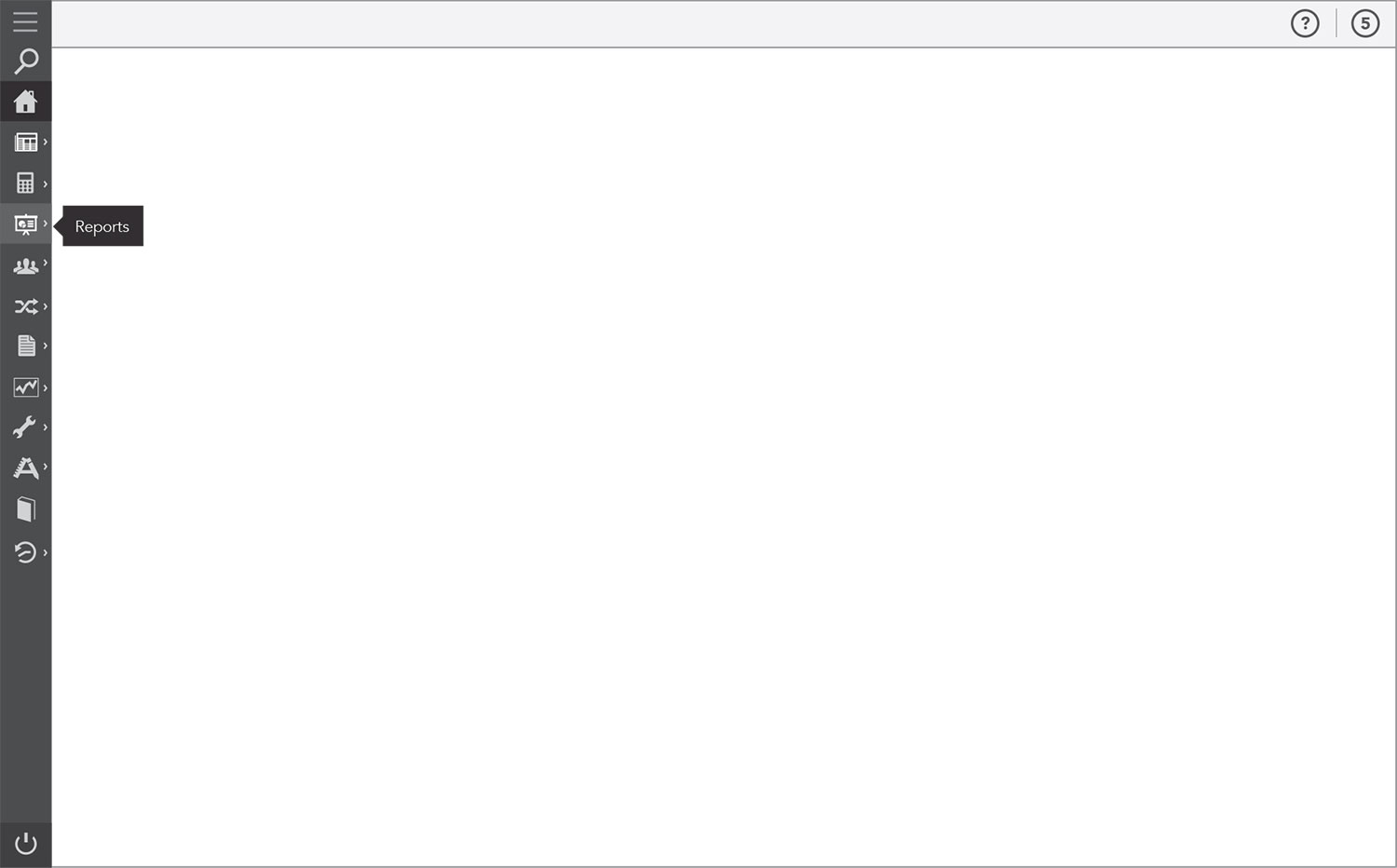
The previous nav could be collapsed so that it took up less screen real-estate. The apps would responsively adjust to fill the additional space.
Initial Wireframes
An initial set of wireframes was presented in scenario format. The visuals were more detailed than in a normal wireframe so that development could quickly and accurately begin sizing the effort. I've pulled out a few key frames from the scenario below.
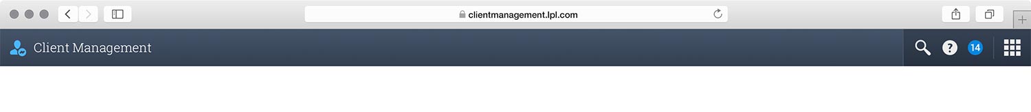
The new navbar ran across the top of the screen instead of down the side. We discovered that users were switching between apps using in-app contextual links instead of switching with the nav. The new nav makes launching a new app take an extra click, but it uses less screen real-estate.
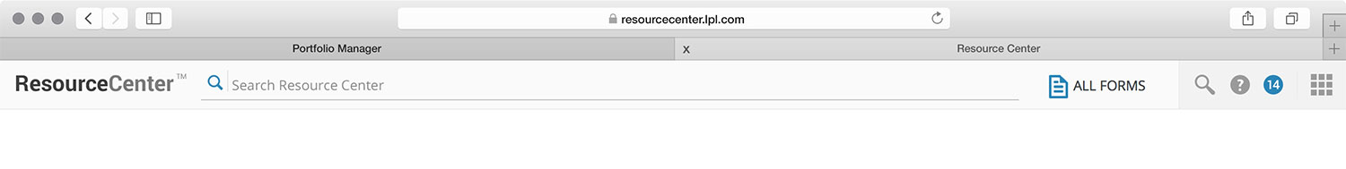
Individual apps could customize the nav bar. They could change its appearance and insert their own controls into the left side of the bar. This capability gave each app its own feel and made 3rd party apps, which would not necessarily share our UX or visual patterns, feel more integrated.

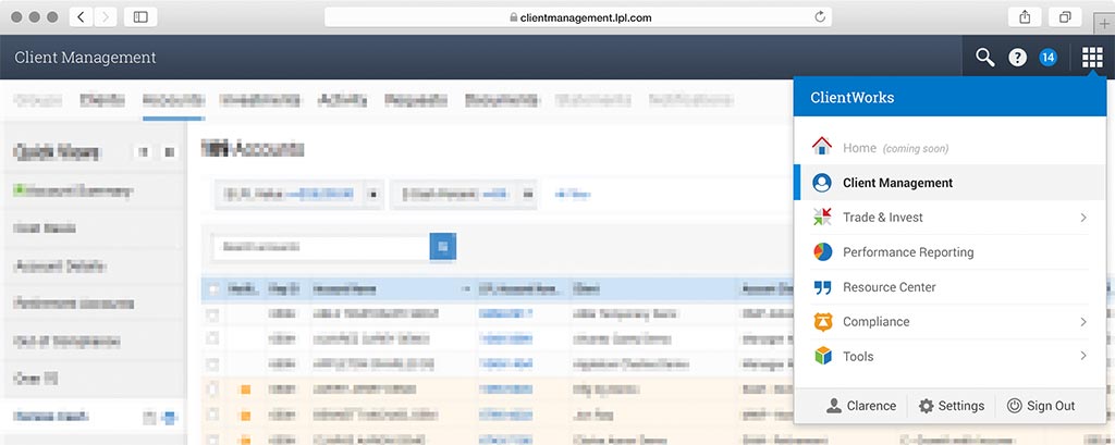
Global ClientWorks controls lived on the right side of the nav. We intentionally minimized the amount of space they took up so that individual apps could have more room to add their controls to the top bar. Clicking the grid icon on the far right would launch the nav popover.
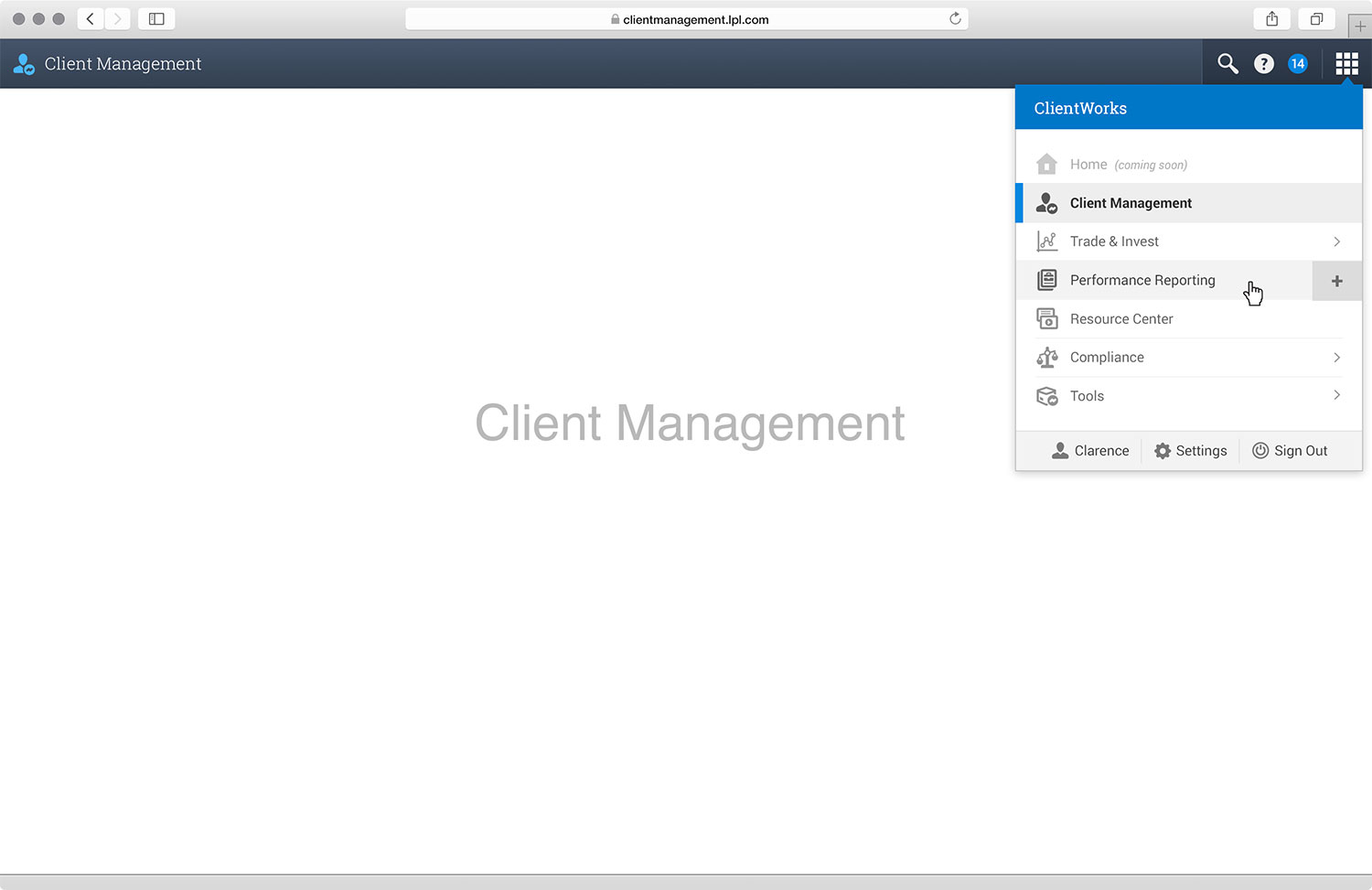
Clicking on an item in the nav would open that app in the current tab. Users could click the "+" icon on the right side to open the app in a new tab. This was a new paradigm for multitasking. The previous nav relied on a legacy system based on iFrames. The new system relied on browser tabs and gave users much more flexibility over when and how new apps were opened.
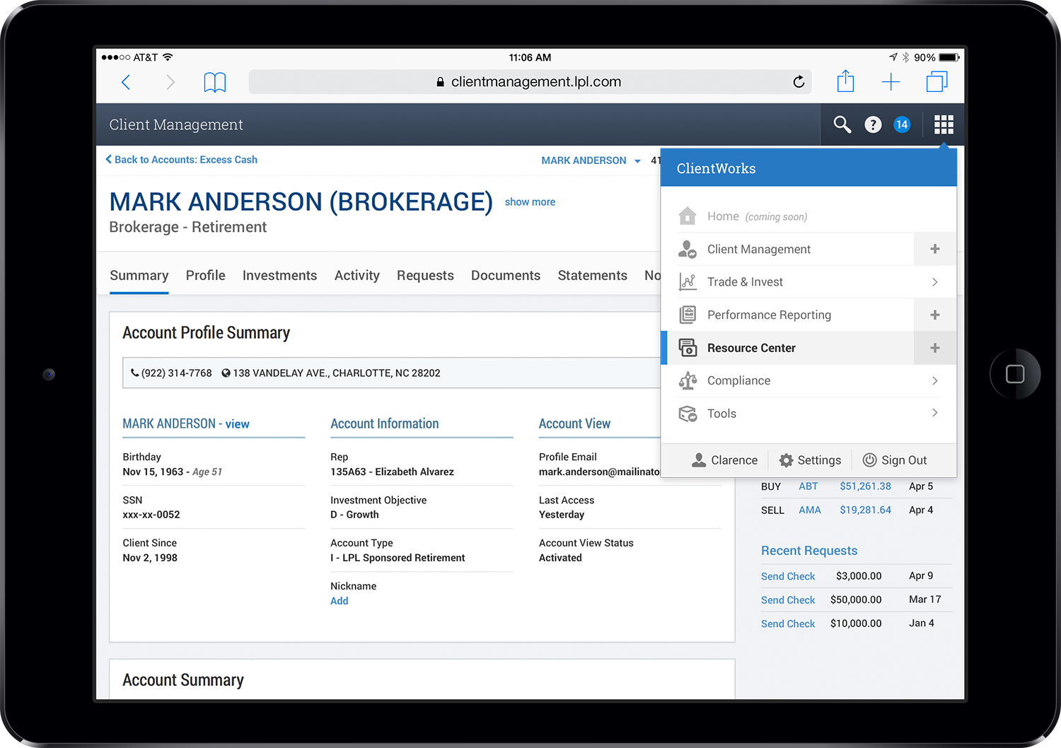
The new nav was designed to be much more mobile friendly. Its tablet experience was very similar to the desktop experience. Small changes, like having the new tab "+" icon always visible, were made to optimize the UI for touch.
Detailed Wireframes
Detailed wireframes were created to illustrate how specific scenarios should be handled.
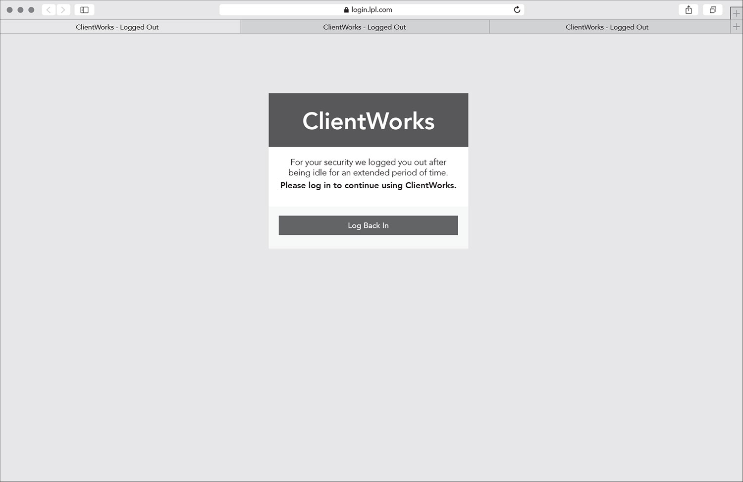
One of the key features of the new nav was the ability to restore tabs after logout. With the previous version of the nav, if a user logged out or was timed out, whatever work they had opened was lost. With the new nav, when users logged back in to one tab, all the other tabs would automatically be logged back in to their previous state.

A system-wide alerting framework allowed emergency notifications to be pushed to all users.
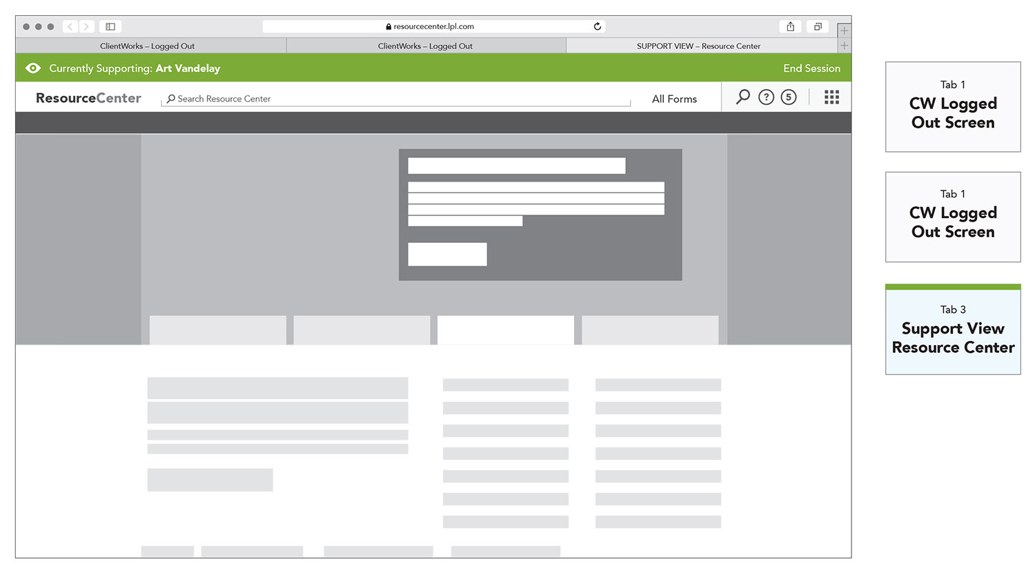
Impersonation capability allows support representatives to log in as the user and see what they see. Special attention was paid toward managing previously open tabs and making it easy for support reps to switch between different impersonated users.
Visual Specs

Part of a spec showing which parts of the global nav could be customized.
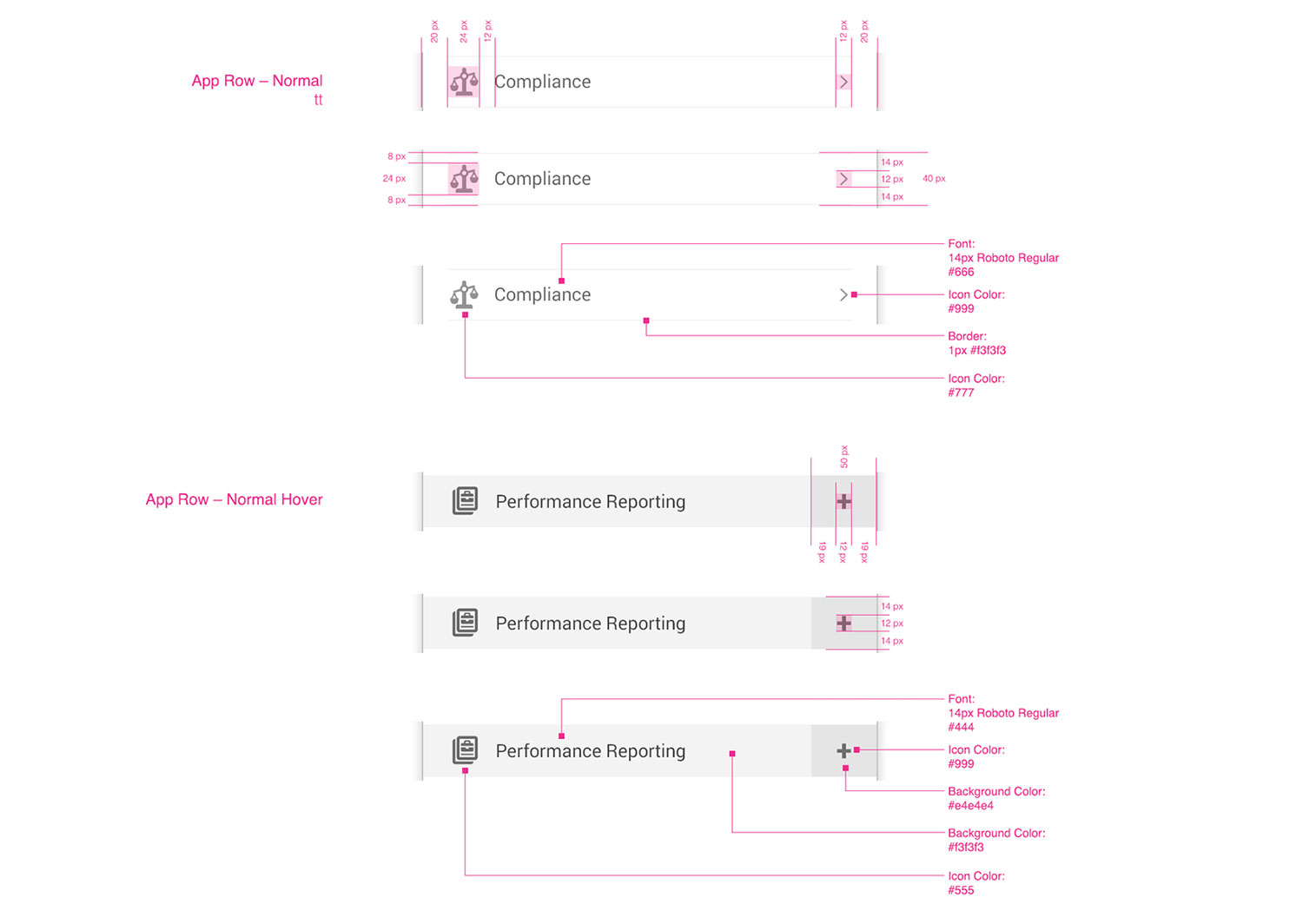
Part of a spec showing how the app launcher should be displayed.

Part of a spec for a built-in dropdown control that apps could leverage if needed.
Final Icons
I worked with development to create a new technique that allowed us to use full color vector icons. Previously we used SVGs which limited our icons to a single color. I designed new icons that took advantage of this new capability. I used simpler shapes and distinct colors to differentiate the icons and make them more recognizable.
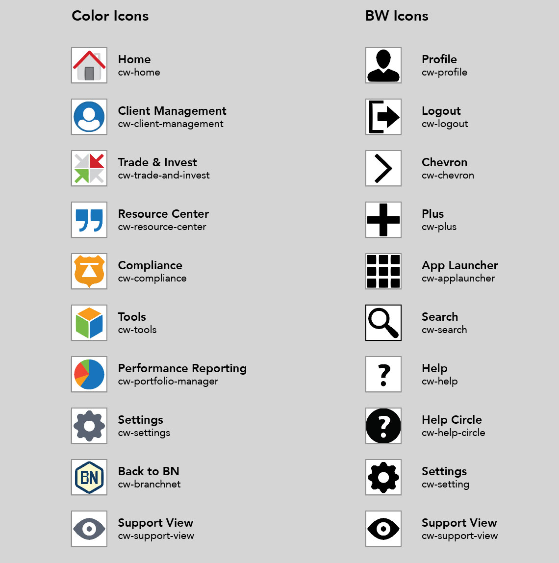
Icons were created in Illustrator. Final versions were exported in vector format and as raster PNGs for use in older browsers.