Collaboration App
Mobile Application Concept
I served as the design lead for a team asked to "rethink" a mobile collaboration app. While quite functional, the existing app's interface made it difficult to perform certain key tasks, leading to complaints from novice and advanced users alike.
Through a rigorous design process, we identified opportunities for improvement, proposed and tested solutions, and ultimately created a final document that could serve as a roadmap for future product development.
The new designs and features that we proposed did not require changes to the underlying services that powered the app. Those services were shared by other collaboration tools and proposing changes to them would have significantly lowered the chances of our designs being implemented and ultimately benefiting our users.
In addition to being the team lead, I also served as the interaction designer. I was joined by a visual designer and a user researcher. Unless otherwise mentioned, all work shown on this page was created by me.
Framing the problem
Through the creation of personas we narrowed the target of redesign and focused on key user goals. The personas, problem statements, and user goals allowed our team (both the design team and the broader product management and development teams) to gain consensus and define what success meant before starting to design.

We defined a number of personas and rated their current satisfaction with the app. We determined that the largest opportunity for improvement lay with novice users who preferred mobile to desktop.

We defined a number of user goals from the perspective of our personas. These allowed us to focus our efforts and provided a metric by which we could gauge success.
Ideation
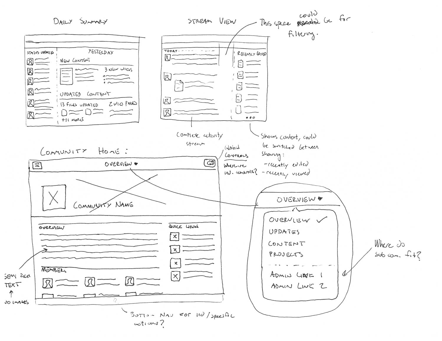
Through quick sketches I explored new layouts and features that would help address the user problems we defined earlier.
Initial Wireframes
We used early wireframes for user testing and validation. Through multiple iterations we refined and narrowed our focus.
An early wireframe exploring navigation.
Final Wireframes
The final set of wireframes was presented in scenario format. I've pulled out a few key frames below.
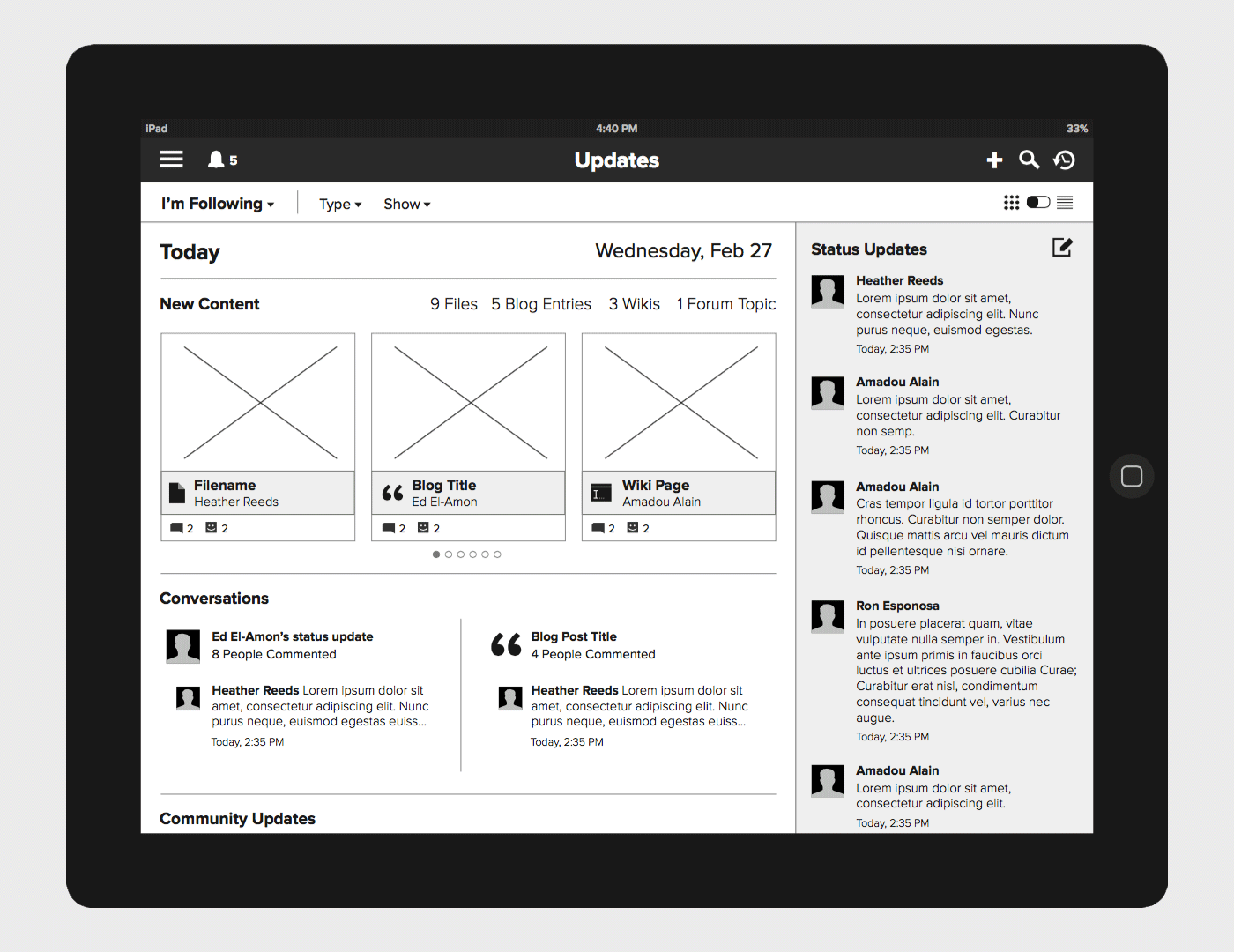
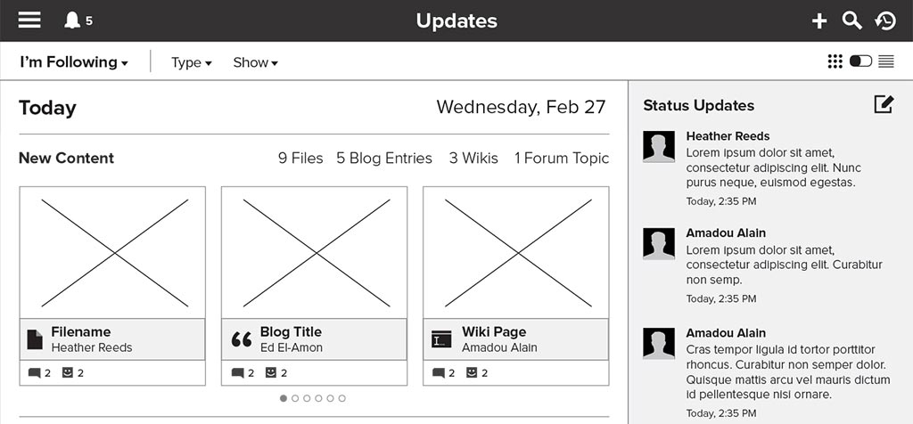
When first opening the app, users are taken to the "overview" page. Here, their activity stream content is rendered in a new way that makes it easier to see what has happened recently. Activity stream content is broken down by day and summarized in easy to understand sections.
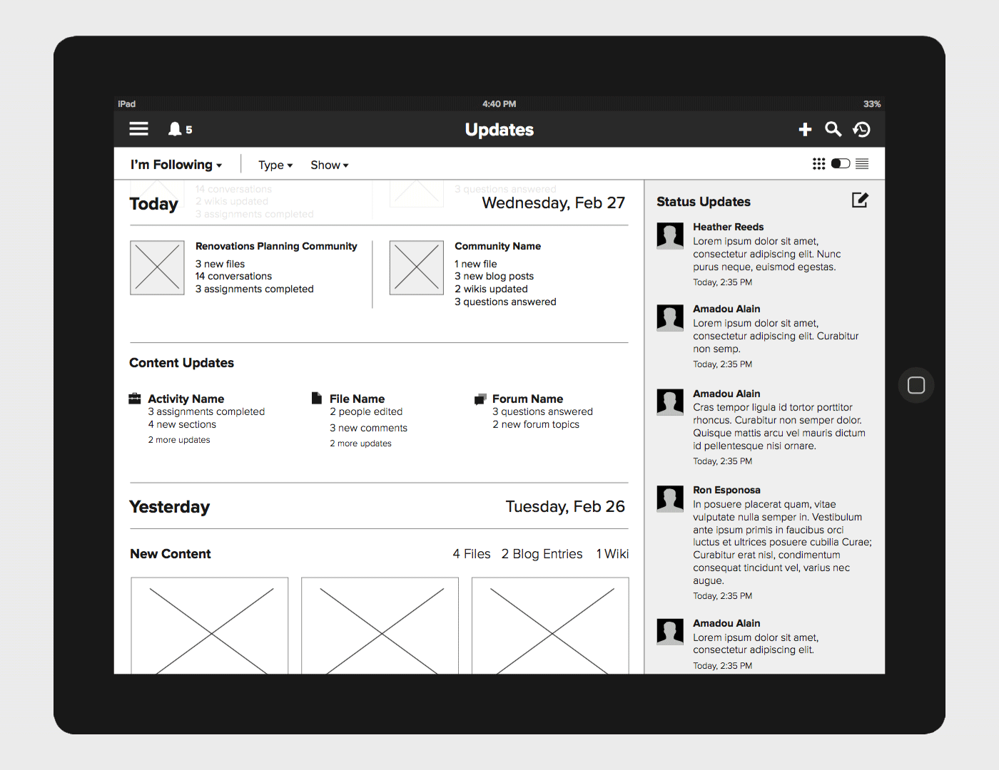
Users could scroll back through the stream to see what happened on previous days. This made it easy for users to see what they missed since the last time they opened the app.
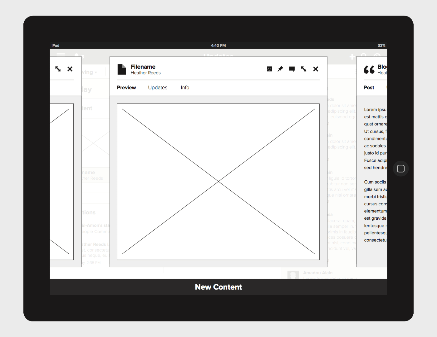
If a user tapped on a piece of content, a modal would appear with a preview. In many cases it is not clear what content is just from its name. The preview feature allows users to quickly determine whether or not a new piece of content is valuable.
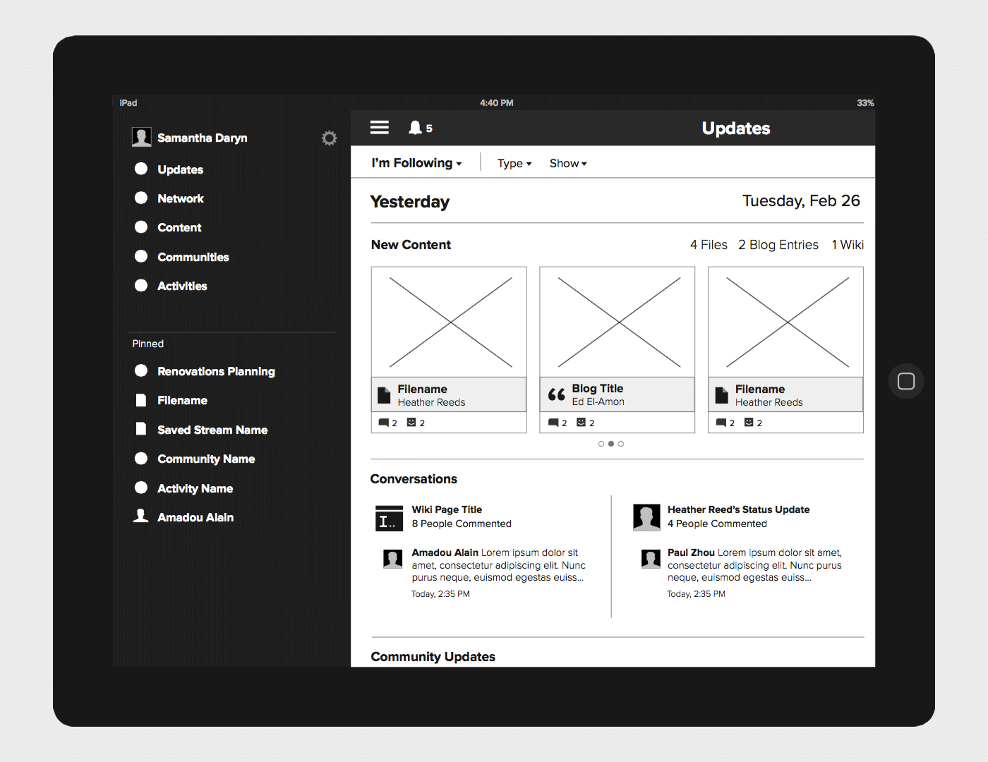
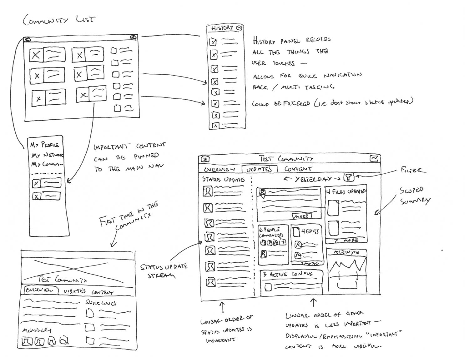
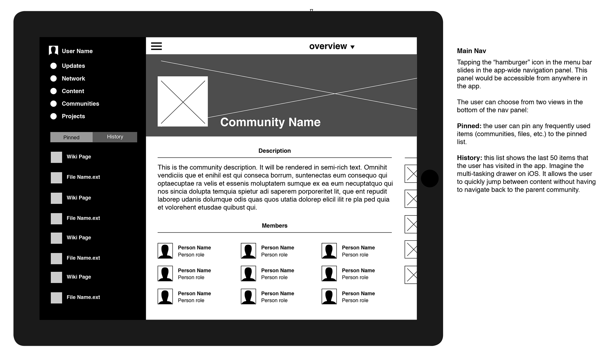
The app's main navigation could be accessed by tapping the hamburger icon. It could also be accessed anywhere in the app by swiping in from the left side. We combined many of the previous nav items into a single "content" entry (more on that later) which freed room for the user to pin his or her own items. This allows each user to customize the navigation to work the way they want.
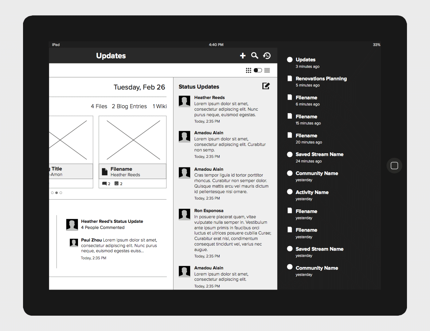
The history menu, accessible by swiping in from the right side, was another new navigation feature. It allows users to quickly return to content that they were viewing previously. With the history menu in place, switching between two pieces of content takes two taps instead of the previous fourteen.
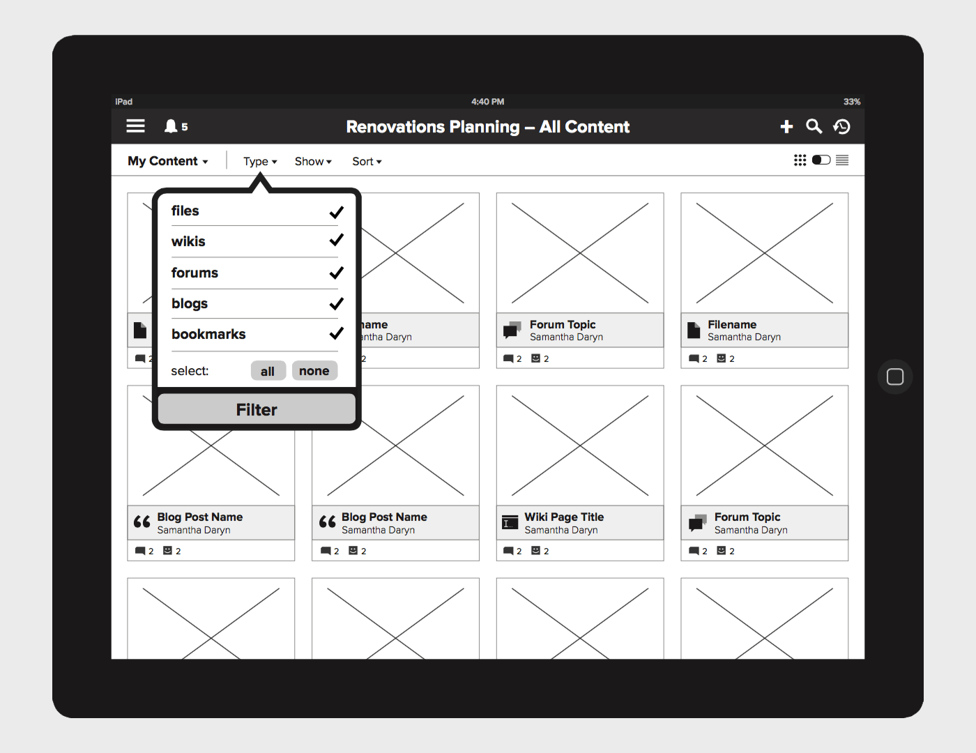
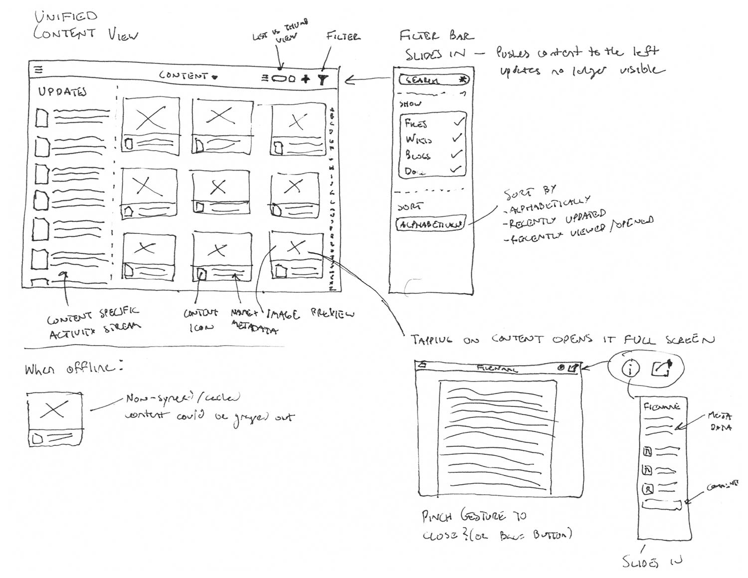
The unified content view allows users to access all of their content irrespective of the app that was used to create it. The view could be filtered to help find a specific type of content if needed.
Animated Demo
For the final presentation, I created this animated demo in keynote. It demonstrated how adding transitions (like the thumbnail scaling to fill the modal when it's tapped) could help the user maintain context. This was an issue with the previous version of the app where users would often end up somewhere without knowing how they got there.
Please note: I created the demo and designed the animations, but the visual design shown in the demo was created by a member of my team.