IBM Connections
iOS and Android Apps
I served as the design lead for IBM's Connections mobile apps. I was responsible for the visual and UX design for iPad, iPhone, and Android apps.
Connections is enterprise social business software designed to facilitate online collaboration. It is immensely powerful, but also very complex. My primary design challenge was to simplify that complexity in order to create an enjoyable and usable mobile experience, while at the same time retaining the functionality that our customers demand.
Throughout the design and development process I worked closely with product management and development to ensure that user goals were met in the best way possible, and that my designs were properly implemented.
Typical deliverables include wireframes, prototypes, visual specs, and interaction specs, along with final production assets like icons.
Case Study: FileSync
One of the most requested features for Connections was dropbox-like functionality for the file library. While this functionality seems simple on the surface – allow users to access their files offline – actually implementing offline functionality that fit into our users' workflows was much more complex.
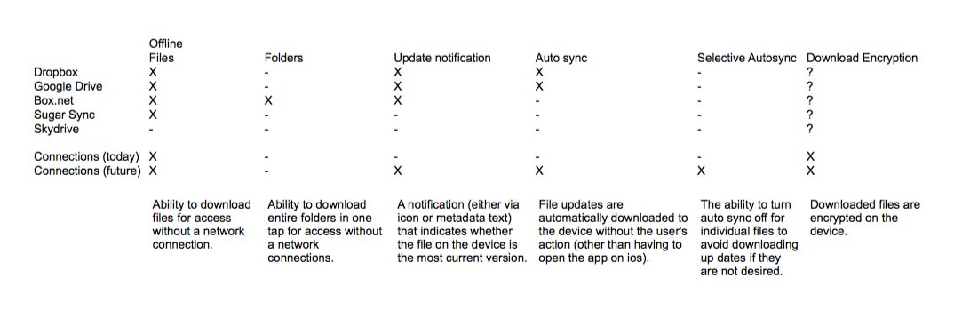
The first phase of the project focused on what our users meant when they said they wanted it to "work like dropbox." I performed a competitive analysis of other mobile file sharing apps to determine key features. I also performed some initial interviews with current users to better understand their workflows and to determine a rough feature prioritization.
In the second phase of the project, I crafted an initial set of designs that integrated the high priority features into the Connections files app. I created a keynote prototype that would allow users to tap through a number of scenarios directly on the ipad. This hands-on testing was important since the existing Connections app had the ability to download files, but many users didn't realize the feature existed. We wanted to be sure that the new download functionality was intuitive and easily discovered.
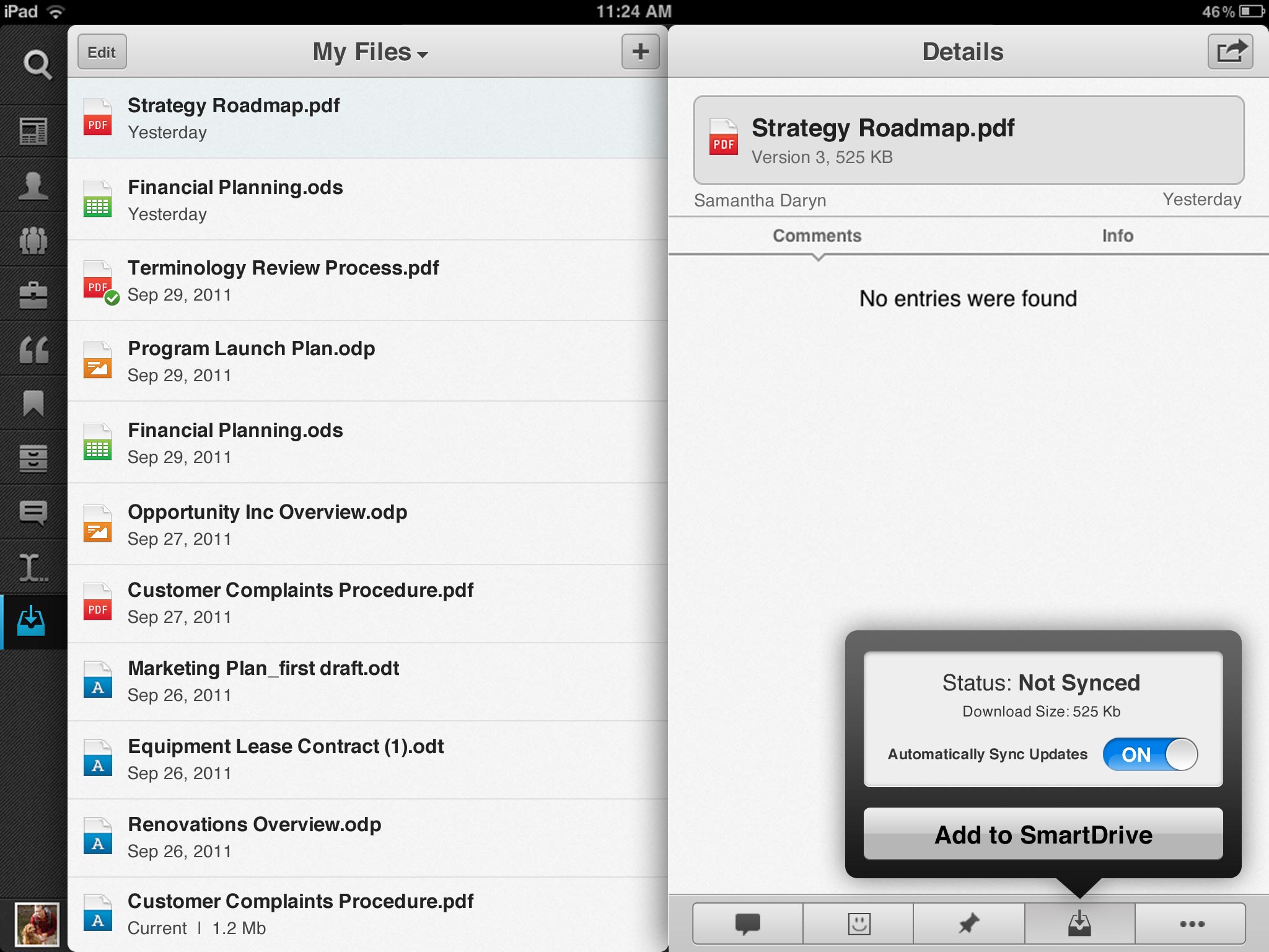
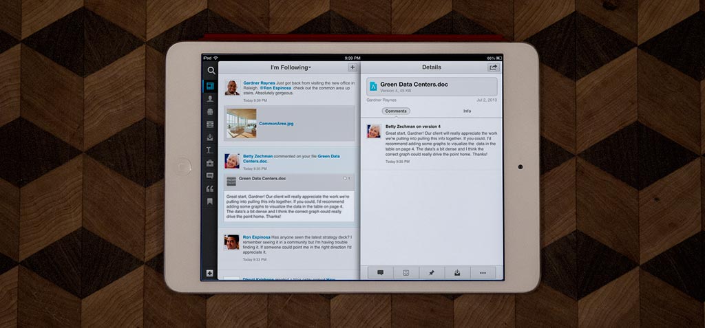
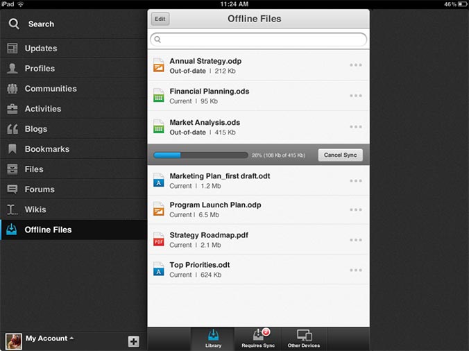
Further refinements to the design followed. This is a screen from an interaction spec I created for development. Similar specs were created for iPhone and Android. Download the full spec. The final design added an "action bar" to the bottom of each file details panel. A filesync button allowed users to selectively sync files to their device. Users could also choose whether files would automatically sync when they were updated. A similar action bar in the files list allowed users to sync files without visiting the details page. Icons added to each synced file's icon indicated sync status.
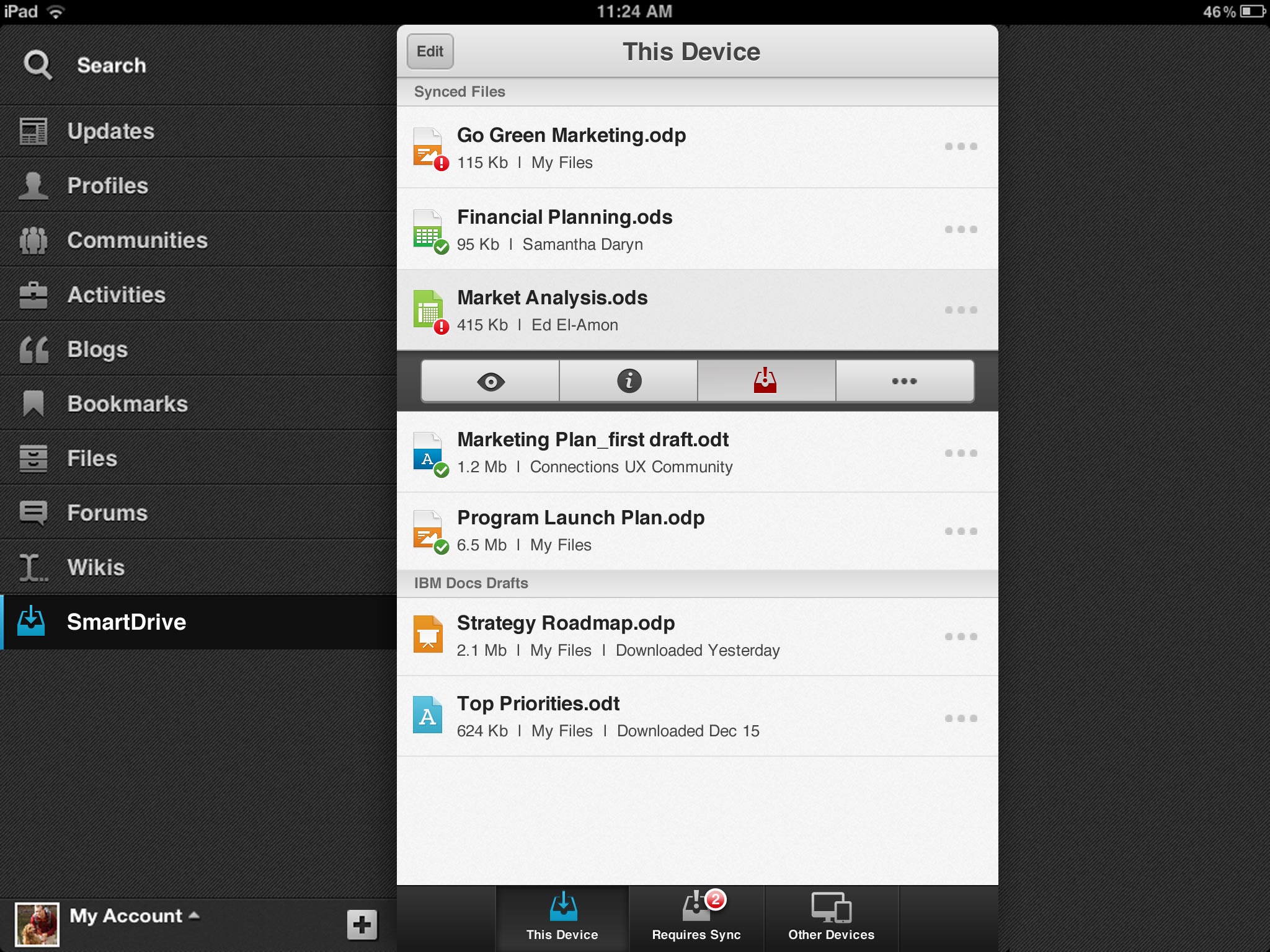
A similar action bar was accessible for each file in the file list, allowing users to sync and update their files without leaving the files list. One of the biggest complaints about the previous files experience was that tapping on a file opened the file details page instead of opening the file. We changed the behavior so that tapping on the file opened the file. Users could still get to the file details page using the action bar.

When users added files to their device they could choose whether or not to enable "autosync." With autosync, any updates to the files would automatically be synced to the device. If a user didn't turn on autosync they would be notified about the update, but they would have to manually choose to sync it.
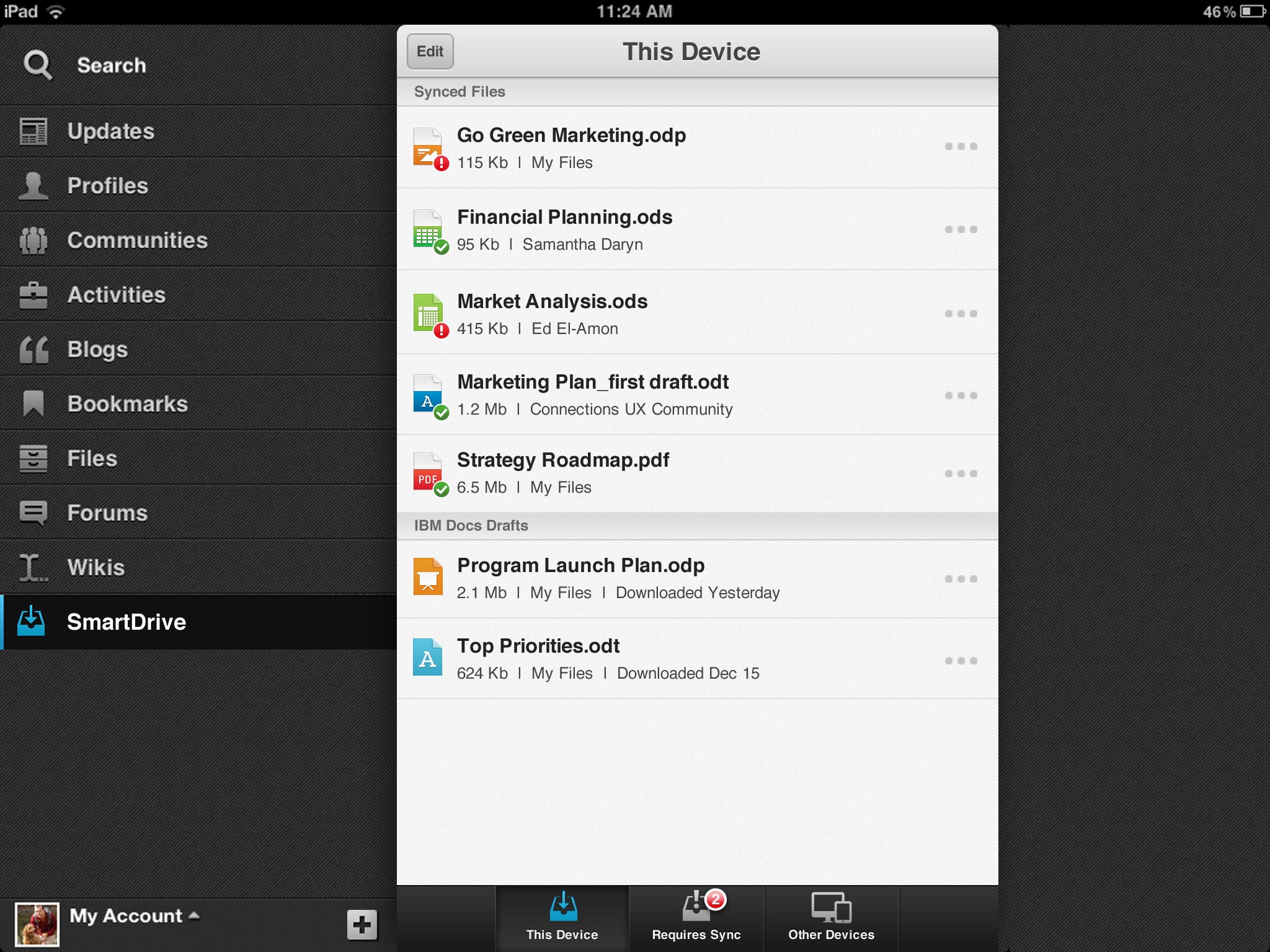
Icons were added to the file icon to indicate the file's sync status. Files that were synced and up-to-date had the green check icon. Files that were synced but hadn't updated yet had the red exclamation point.
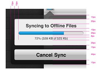
After the designs were finalized, we began the development process. This is a sample of a visual spec I sent to development for the file sync popovers.

I designed all of the file sync icons. Each icon was optimized for different device resolutions.