Handbook of Latin American Studies
Online Catalog and Branding
In an effort to modernize the Hispanic of Latin Studies website the Library of Congress decided to migrate its contents into the framework used for other Library Catalogs. This migration has many benefits. The modern catalog framework is responsive, accessible, and provides powerful search features that will allow users to more easily find HLAS content. Users who were already familiar with the search capabilities in the normal library Catalog would immediately be able to perform advanced searches in the HLAS catalog.
Prior Design
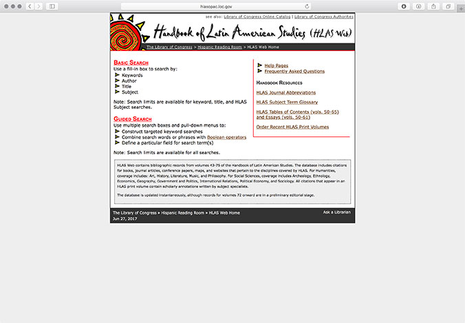
The original HLAS website was more than 15 years old at the time of the redesign. Functional, aesthetic, and accessibility improvements would be required.

The handbook's branding, while memorable, was particularly dated. The sun logo was designed more than 20 years ago and original source files had been lost.
The Library of Congress Online Catalog
The LOC's online catalog framework would serve as the basis for the redesign.
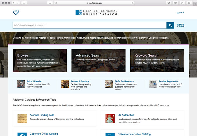
The Library of Congress Catalog site uses a modern responsive design and many library patrons and researchers are familiar with how to use its advanced search capabilites.
Logo Ideation
The sun logo used on the current HLAS website and in print publications was very familiar to users and the business expressed a desire to utilize the sun and the red and yellow color scheme in the new branding.
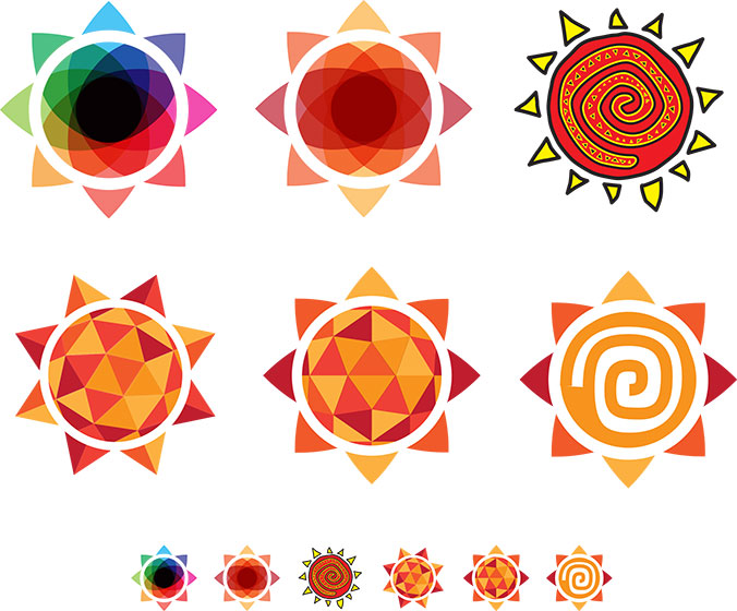
I explored a number of alternative logos that utilized the sun metaphor.

Ultimately the team settled on this logo. The petals used to construct the sun shape were inspired by the abstract flower imagery used in the Mexican Talavera Tiles that line the Hispanic Reading Room. The red color scheme used in the sun was choosen to maintain continutity with the existing logo, while the deep blue used in the text was taken from the Talavera tiles.
Page Ideation
I worked through a number of designs for the HLAS homepage. Ultimately I presented the team with two approaches:
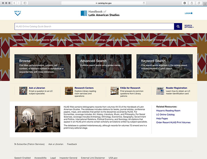
This approach used a simpler design and looked more like the Library's main catalog. The red and yellow pattern provided some visual interest but was intended to recede into the background.
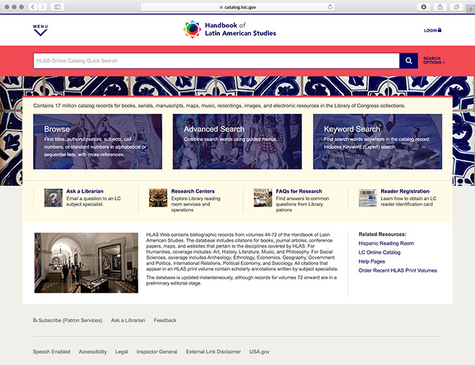
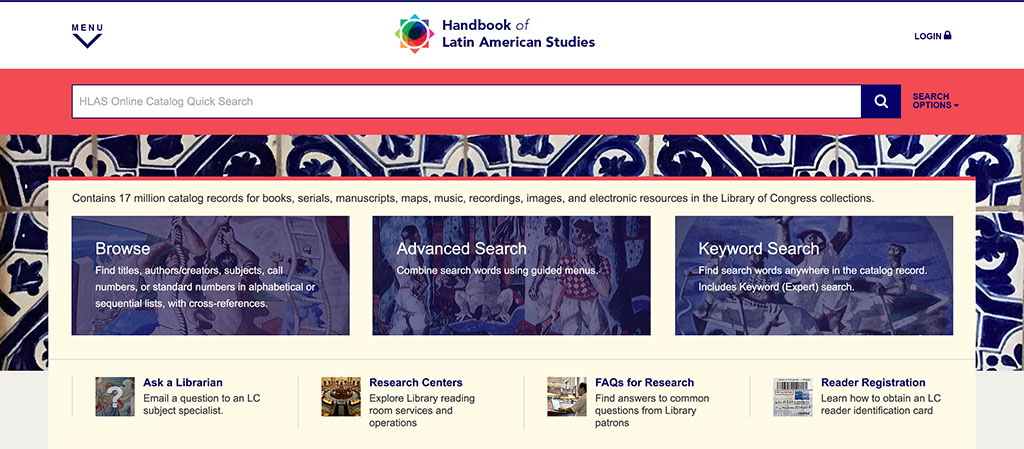
This approach used a more radical and dramatic design. I photographed the Talavera tiles used in the main Hispanic Reading room. These became the focal point of the page with the bright coral red and deep blue highlight colors clearly differentiating the page from the normal LOC Catalog.
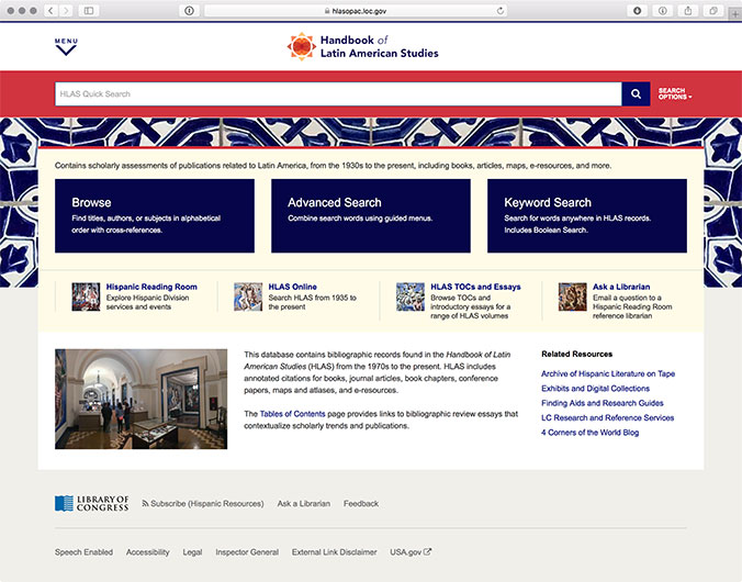
The team preferred the more radical design, but felt it was a little too busy. I simplified some of the imagery, adjusted the colors slightly, and inserted the red version of the petal logo.