IBM SmartCloud
Social Business Website and Branding
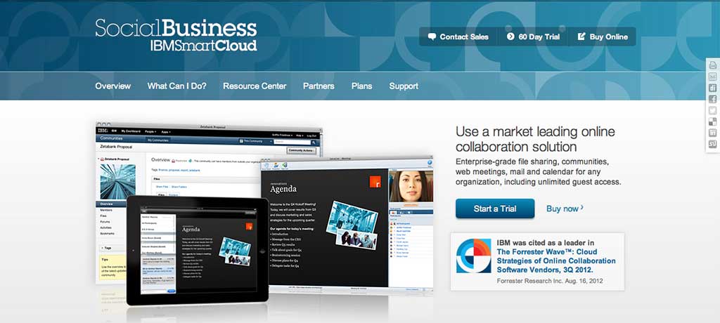
My first project at IBM was to rebrand IBM LotusLive as IBM SmartCloud for Social Business, and to create a new marketing website for the rebranded service. The new website was designed to feel at home in the SmartCloud brand family while also conforming to IBM corporate web standards.
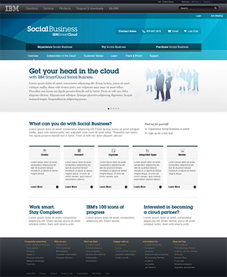
I performed a competitive analysis, a site audit of the existing website, and interviewed sales and product management stakeholders to understand the challenges of marketing and selling a cloud product. From this work, I developed a series of guidelines that would define the design and built a site wireframe that would guide its structure.
Special attention was paid toward creating a modern and attractive design language. Imagery was carefully selected to be both engaging and easily updatable. In order to create a guided user path (something lacking in the existing website), the total number of pages was kept as low as possible. Content was carefully curated to address possible concerns while emphasizing IBM's competitive advantages.
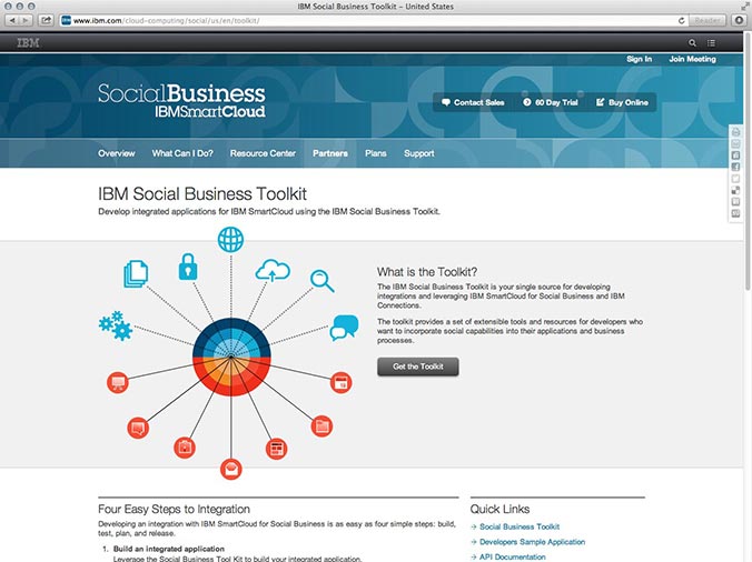
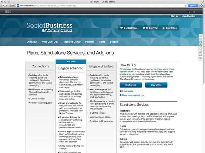
Please note, recent updates to the SmartCloud site have been performed by another team. While most of my design is still in place, the screenshots below show the most accurate representation of what I designed.
Initial Research and Designs
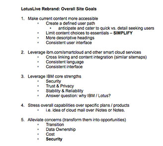
I started the design process by creating a list of overall goals for the redesign. Once socialized to the rest of the team these goals became a guide and served as a metric for success.
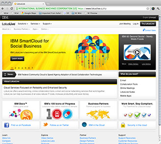
I performed a site audit of the current Lotus Live webfront. Over the years the site had grown to be quite complex and difficult to navigate.
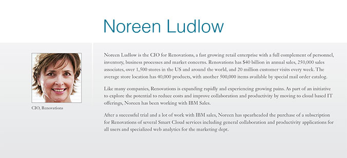
With the larger Smart Cloud team we defined a number of personas. These ranged from buyers at large enterprise customers (shown above) to individual users at small companies.
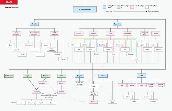
An early sitemap showing a new content model for the SmartCloud for Social Business site. The content model was designed so that it could be applied to other SmartCloud websites (like SmartCloud for Smarter Cities).
User Testing and Refinement
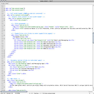
I hand coded prototypes using the custom IBM CSS framework that the final site would be developed with. These prototypes were used for user testing and to ensure that my designs could be implemented under the limitations of the framework.
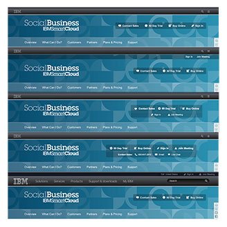
A composite of 5 slides from a user test where we tested the effectiveness of various header designs.
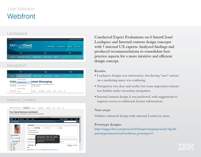
We frequently reported back the results of our user testing and validation to the larger Smart Cloud team.
Final Designs
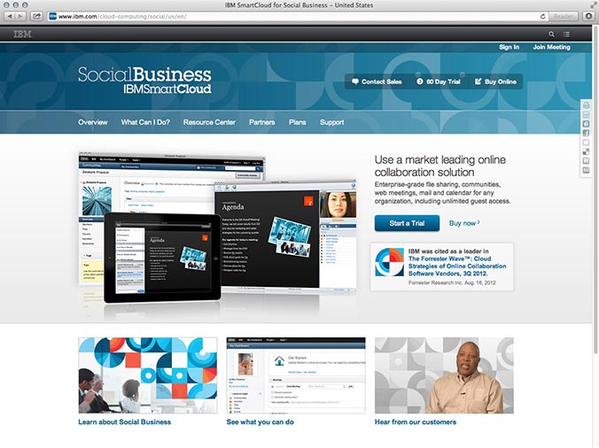
The SmartCloud for Social Business homepage shares a similar visual language with other SmartCloud and IBM websites.
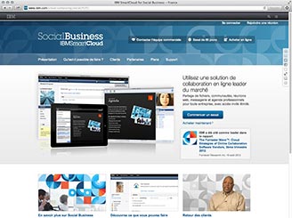
The website is translated into over 20 languages. Special attention was paid during the design process to ensure that the layout would hold up with different languages.
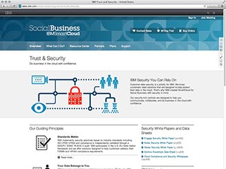
The pages in the overview section inform the user about SmartCloud in a general sense. They attempt to address typical cloud concerns (like security) while emphasizing IBM's advantages. All graphics on this page were custom-created and designed to match the styles used in other SmartCloud brand icons.
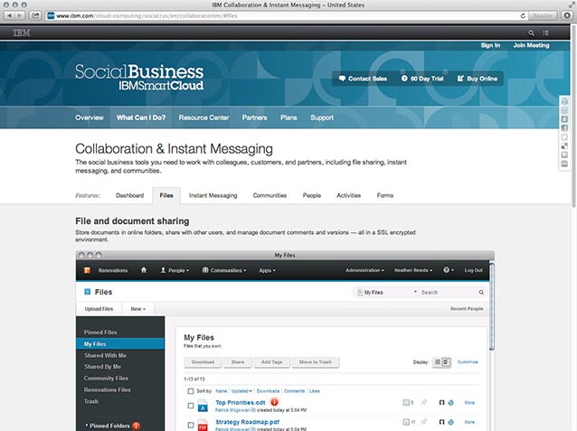
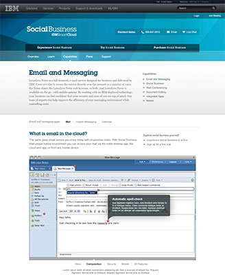
The "What Can I Do" section allows users to discover SmartCloud for Social Business' capabilities. Capabilities are grouped into common use cases, like Collaboration, with sub-tabs for each specific capability.
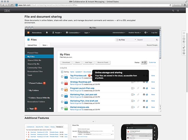
Rather than rely on custom imagery, we attempted to use actual screenshots of the product wherever possible. This makes the site easier to update and allows the product to speak for itself. Red dots on the screenshots allow the user to discover features in context.
